Case Study · Healthcare · Web
Driving Deeper Engagement: Premera SEBB Ecosystem Redesign
A multi-page health plan experience redesigned for clarity, confidence, and decision support.
Making complex health decisions feel manageable
Washington State’s School Employees Benefits Board (SEBB) open enrollment requires educators to choose health plans for themselves and their families. Premera’s existing SEBB pages were dense, fragmented, and difficult to scan, making confident decision-making harder than it needed to be.
As the Lead UX Designer and Information Architect, I redesigned the SEBB digital ecosystem— from landing pages to plan comparisons and provider search flows—to make complex information clear, scannable, and supportive for high-intent users.
Lead UX Designer & Information Architect
I guided the end-to-end UX and information architecture for the SEBB ecosystem redesign, shaping how users moved through the experience and how complex health plan content was structured on each page.
- Defined information architecture across the SEBB journey
- Designed page frameworks, layouts, and user flows
- Collaborated on UX writing to simplify dense policy content
- Established comparison patterns and CTA hierarchy
- Aligned with content, legal, and brand stakeholders
- Provided UX guidance for the kid-led program video
- Performed pre-launch UX consistency reviews
The Challenge
SEBB members must compare multiple plan types, interpret premiums and deductibles, and confirm if their doctors are in-network—all while navigating unfamiliar terminology and enrollment deadlines. The previous experience relied on long paragraphs, inconsistent layouts, and scattered links, making it difficult for users to understand where to start or how to compare plans.
The challenge was to transform this content-heavy environment into a cohesive, educational ecosystem that helps school employees quickly understand their options and feel confident choosing a plan.
What we learned
UX Strategy & Information Architecture
My strategy focused on transforming complexity into clarity through predictable structure, scannable layouts, and human-centered storytelling. I restructured the ecosystem so each page followed a clear rhythm—overview, education, details, and action—while aligning navigation to users’ primary tasks:
- Find a plan
- Find care
- Compare options
- Enroll
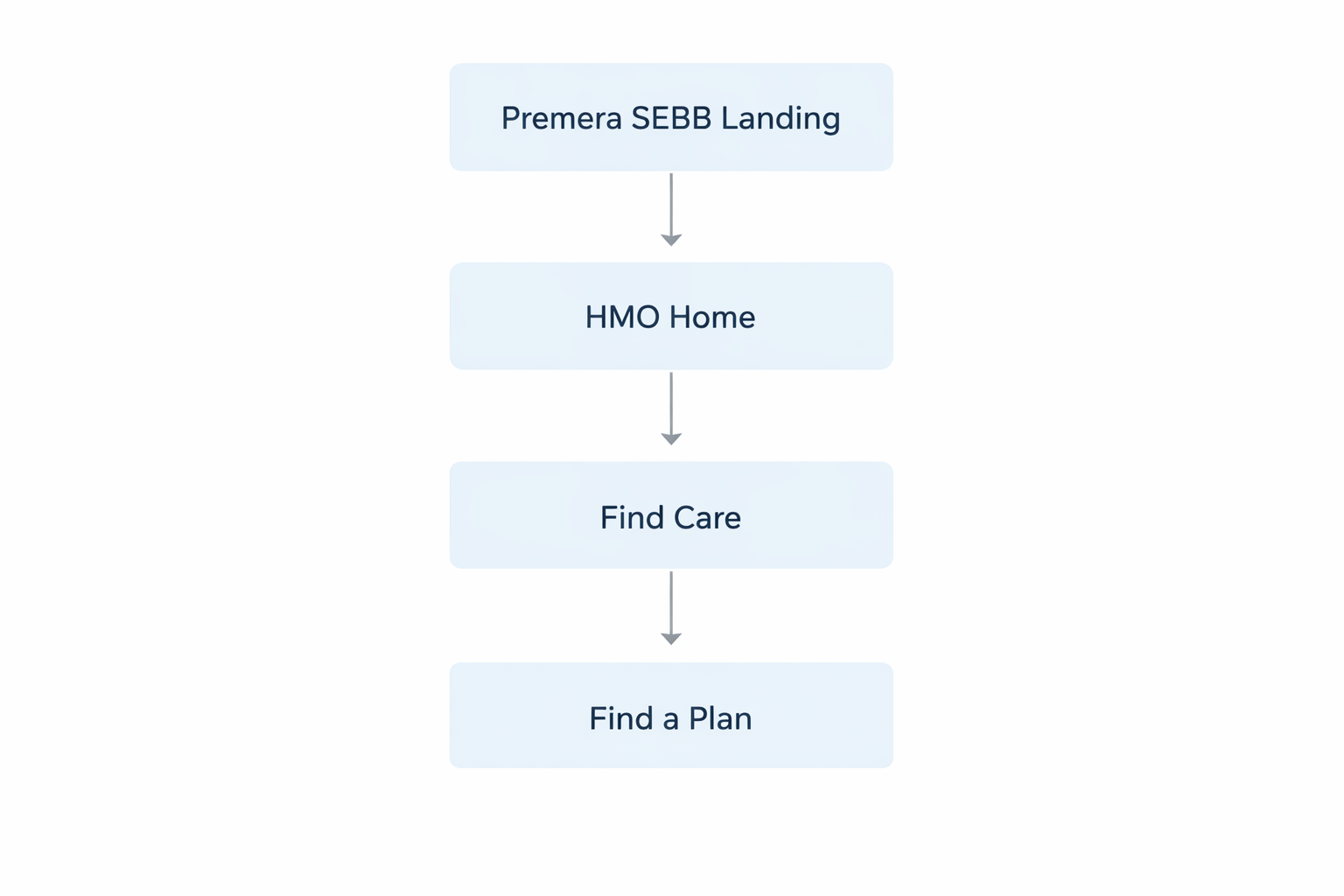
The updated IA connected four core experiences—SEBB landing, HMO plan detail, Find Care, and Find a Plan—plus supporting content for events, benefits, and documentation.

Structuring the experience
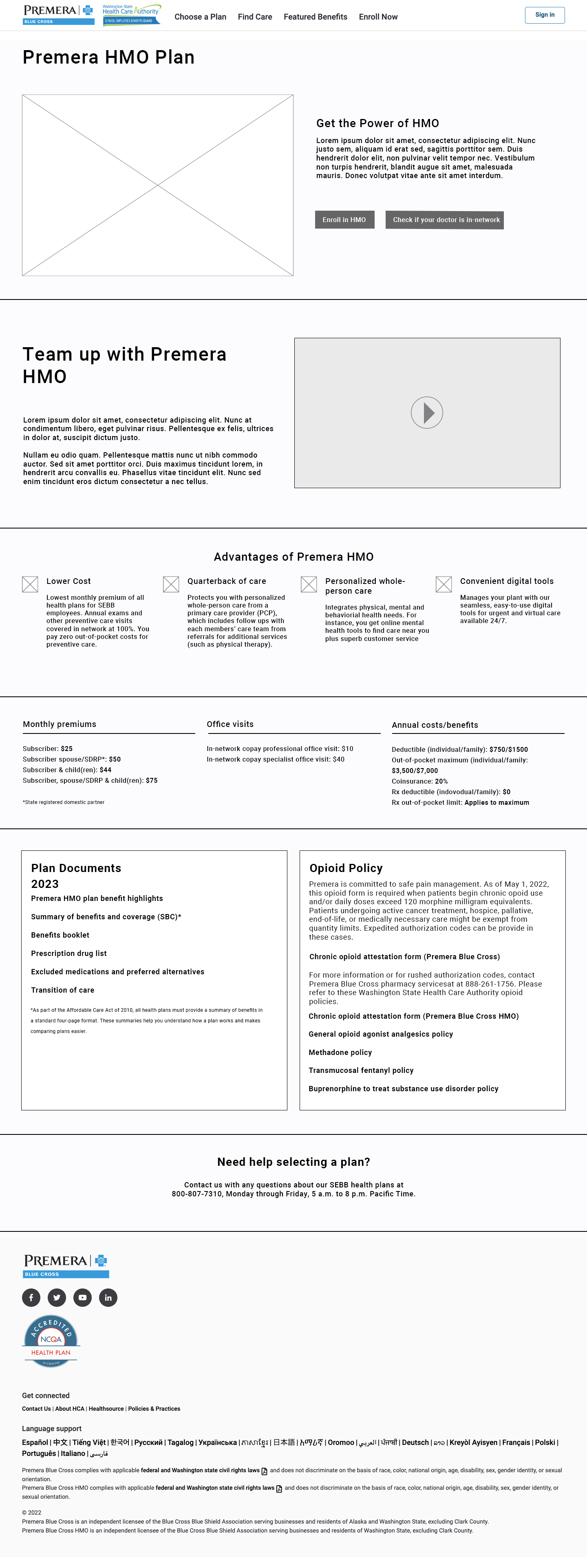
I created low-fidelity wireframes to validate page hierarchy, content groupings, and interaction patterns before investing in visual design. These helped align stakeholders on structure across the SEBB ecosystem.


Bringing the ecosystem to life
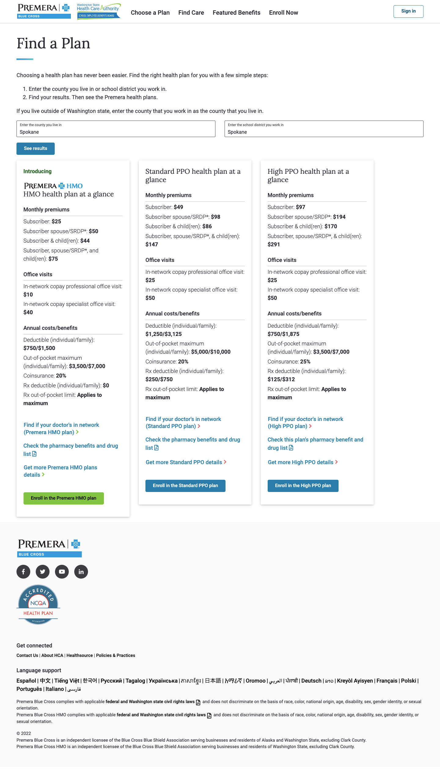
The final designs applied Premera’s brand system while emphasizing clarity, comparison, and support. Each page uses consistent patterns so users can quickly recognize where to find information and what to do next.


Outcomes & Impact
Early analytics from the first 30 days post-launch showed strong engagement and decision-focused behavior across the redesigned experience.
What I learned
This project reinforced the value of strong information architecture in high-stakes, content-heavy domains like healthcare. Small structural decisions—such as how plan cards are grouped or where provider search lives—had a large impact on user confidence. With additional time, I would run moderated usability testing with SEBB members to further refine comparison patterns and explore personalized plan recommendations.