Case Study · Education · Multi-Platform
Designing a Multi-Platform NGSS Science Experience for Grades 3–5
A four-year collaboration with HMH to build an NGSS-aligned science program across web, tablet, mobile, and print—supporting students, teachers, and multiple state adoptions.
Building an NGSS ecosystem for young learners
HMH’s NGSS (Next Generation Science Standards) curriculum for Grades 3–5 needed more than a digital add-on—it required a unified ecosystem that could support inquiry-based science learning across web, tablet, mobile, and print textbooks.
Over four years, I partnered with editors, curriculum specialists, illustrators, animators, engineers, and production teams to design a multi-platform experience that aligned with NGSS, supported classroom realities, and scaled to state-specific versions in Oklahoma, Texas, and California, as well as Spanish-language translations.
My work spanned UX and UI design for digital lessons, visual and animation direction, front-end optimization within the CMS, and parallel print textbook layout—ensuring students and teachers encountered a coherent experience no matter where they engaged with the program.
Lead UX/UI Designer, Visual Direction & Multi-Platform Integration
As a core design partner on this program, I led UX and UI design for the NGSS digital experience across web, tablet, and mobile. I developed user flows, wireframes, and low- and high-fidelity prototypes that shaped how students engaged with inquiry-based science content.
Beyond UX, I directed visual development—reviewing illustrator sketches, shaping animation storyboards, guiding asset creation, and approving final art for Grades 3–5. I collaborated closely with editors to structure lesson pacing, media placement, and interaction patterns.
In parallel, I designed and laid out the print textbook versions of the curriculum, supported Spanish-language translation workflows, and adapted materials for state adoptions in Oklahoma, Texas, and California. I also optimized assets and updated front-end code in the CMS to ensure the designs could be implemented consistently at scale.
- Led UX/UI design for web, tablet, and mobile across Grades 3–5
- Created user flows, wireframes, and low/high-fidelity prototypes
- Collaborated with editors on lesson structure, pacing, and interactions
- Directed photography, illustration, and animation for digital lessons
- Reviewed and approved illustrator sketches and animation storyboards
- Optimized visuals and ensured accessibility-aware patterns
- Updated front-end components and layouts in the CMS
- Designed and laid out the print textbook versions
- Supported Spanish-language translation for digital and print content
- Adapted materials for Oklahoma, Texas, and California state adoptions
- Collaborated with engineering and production on implementation and QA
The Challenge
Creating an NGSS-aligned curriculum for Grades 3–5 meant designing for multiple realities at once: different developmental stages, multi-platform delivery, and strict alignment to standards and state adoptions. Students needed age-appropriate scaffolding, clear visuals, and manageable interactions; teachers needed consistency across digital and print, and straightforward ways to guide inquiry-based lessons.
The program had to function seamlessly across web, tablet, and mobile, while mirroring a fully developed print textbook used for core classroom instruction. Content needed to stay synchronized across formats, media types, and language versions.
On top of this, the curriculum had to support Spanish-language translation and be adapted for Oklahoma, Texas, and California, each with unique standards, pacing guides, and editorial requirements.
The challenge was to design a system that could scale across grade levels, platforms, states, and languages—without losing clarity, usability, or instructional integrity.
Grounded in classroom behavior & learning outcomes
UX Strategy & Experience Architecture
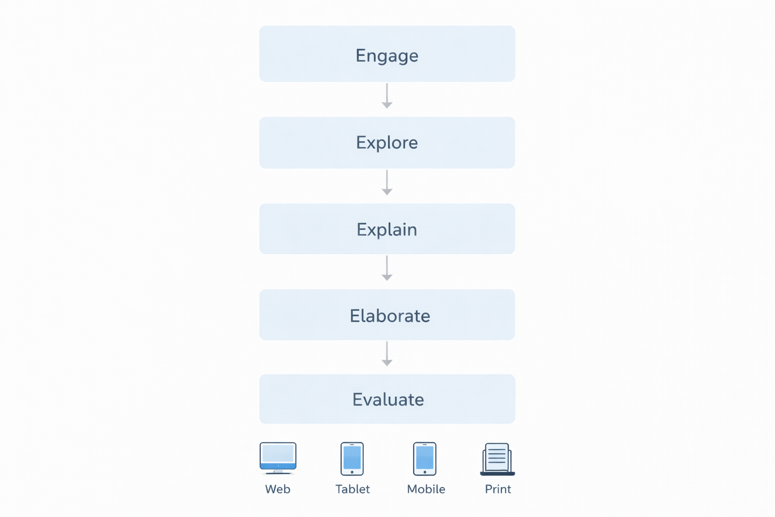
I approached the program as a connected ecosystem rather than isolated lessons. The UX strategy was to guide students through a repeatable pattern that supported inquiry-based learning:
- Engage: Introduce phenomena and questions in an accessible, visually engaging way
- Explore: Scaffold investigations, models, and data interactions step-by-step
- Explain: Help students articulate what they observed and why it matters
- Elaborate: Extend understanding with additional applications or scenarios
- Evaluate: Provide opportunities for formative assessment and reflection
Working from editorial outlines, I translated lesson structures into wireframes that defined:
- Screen-by-screen lesson flow and instructional pacing
- Where and how photography, illustration, and animation supported key concepts
- How much content could live on a screen without overwhelming students
- Which interactions worked best at each grade level (tap, drag, select, type, etc.)
These decisions informed both digital designs and print layouts, ensuring that the instructional “story” remained coherent across formats.

Structuring lessons for young learners
Wireframes were used to align editors, visual teams, and engineers around lesson structure before committing to full visual design. They defined the layout for phenomena introductions, investigations, interactive questions, and checkpoint activities.


Bringing NGSS-aligned science to life
The final designs balanced age-appropriate visuals, clear hierarchy, and interaction simplicity. Rich photography, illustration, and animation were layered into the experience to support comprehension, not distract from it.
Digital interfaces were designed to work across web, tablet, and mobile, while print layouts mirrored the same instructional flow so teachers could move between formats without confusing students.


Outcomes & Impact
The NGSS program delivered both instructional and operational impact across classrooms and internal teams.
significant
What I learned
This project deepened my understanding of how UX, visual design, and instructional design intersect in K–5 education. Designing for young learners meant constantly balancing cognitive load, engagement, and clarity—every layout, interaction, and image choice carried weight.
Working across digital, print, Spanish translation, and state adoptions reinforced the importance of system-level thinking. A strong UX foundation didn’t just improve student experiences; it made it possible for large teams to scale high-quality content across multiple formats and markets.