Case Study · Healthcare · Web & E-commerce
Redesigning MyPreventiveHealth.com for Clarity, Trust & HealthChek™ Conversions
A marketing site and e-commerce redesign that clarified MyPreventiveHealth’s value,
modernized the brand, and made it easy to sign up for HealthChek™ wellness programs online.
View Full Site
From dated brochure site to conversion-ready experience
My Preventive Health is a longevity-focused wellness brand that offers HealthChek™ programs, educational content, and preventive health services. The previous website looked dated, read like a static brochure, and made it difficult for visitors to understand what HealthChek™ actually was or how to get started.
My goal was to redesign the homepage and key marketing pages to:
- Clarify the core promise of HealthChek™ in plain language
- Modernize the visual identity and reflect a more vibrant, aspirational brand
- Introduce a clear, low-friction path to purchase HealthChek™ programs online
- Make the site responsive and mobile-friendly
Lead UX & UI Designer for the Site Redesign
I led the end-to-end redesign of MyPreventiveHealth.com, from UX strategy and information architecture through visual design and e-commerce flow definition. I partnered closely with the founder/physician to refine messaging, prioritize content, and define how HealthChek™ offerings would be presented and purchased.
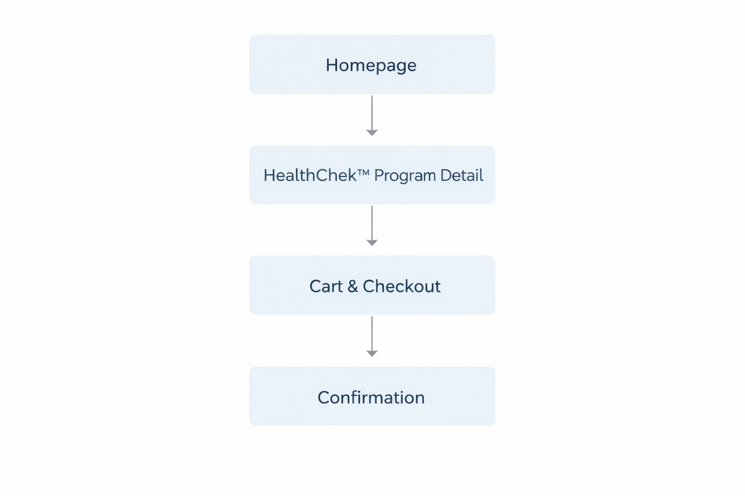
This included restructuring the homepage narrative, designing modules for program cards and testimonials, and mapping the complete sign-up journey—from “Learn more about HealthChek™” to checkout confirmation.
- Defined information architecture and homepage content hierarchy
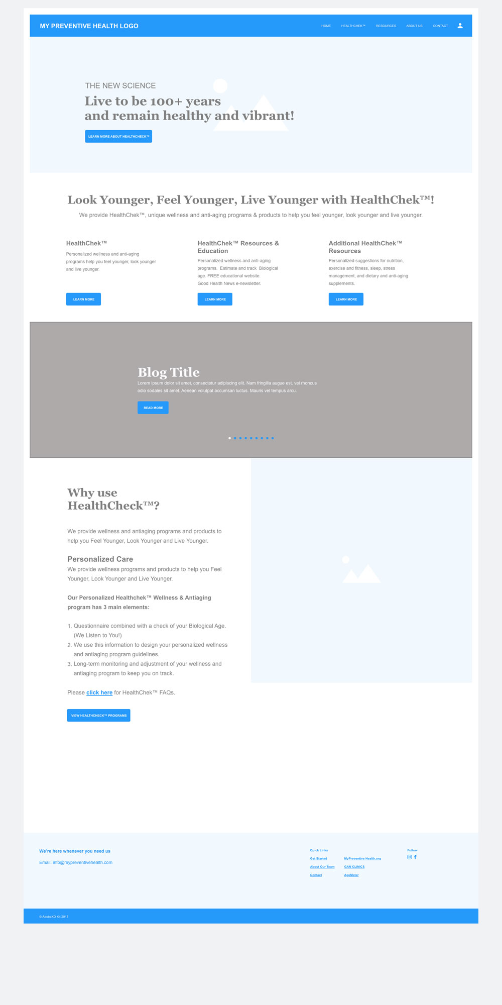
- Created low-fidelity wireframes for the new layout
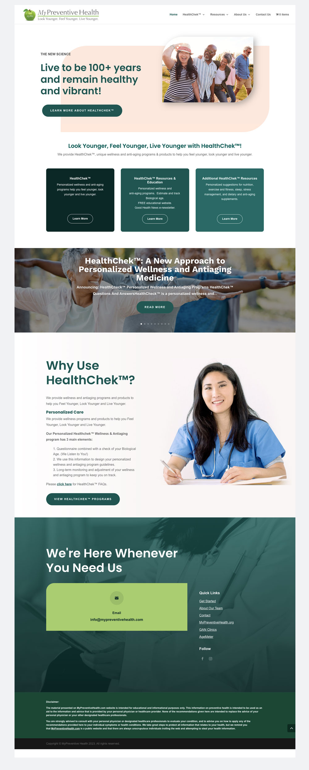
- Designed high-fidelity responsive UI for the homepage and key sections
- Structured the e-commerce flow for HealthChek™ program sign-up
- Collaborated on copy refinement and value proposition clarity
- Established basic design system elements (colors, buttons, cards, typography)
- Provided assets and guidance for implementation by the development team
The Challenge
The previous MyPreventiveHealth site had strong content but weak hierarchy. The homepage mixed long paragraphs with generic stock visuals, making it hard for visitors to understand:
- What HealthChek™ is
- Who it’s for
- What’s included in the program
- How to buy or get started
There was no clear e-commerce path—interested users had to dig through pages or contact the team manually. On mobile, key content and CTAs were buried below the fold, and the site didn’t visually reflect the vitality and longevity the brand promised.
The challenge: turn a text-heavy, dated experience into a modern, trust-building, conversion-ready marketing site that made it easy to purchase HealthChek™ programs.
What we learned about prospective members
UX Strategy & Page Architecture
I reframed the homepage as a guided story:
- Promise: “Live to be 100+ years and remain healthy and vibrant”
- Explanation: Short, benefit-driven introduction to HealthChek™
- Programs: Clear cards for HealthChek™ offerings with “Learn more” CTAs
- Education: Highlight of resources and blog content
- Why HealthChek™: Simple breakdown of how the program works
- Action: Strong CTA to view programs and sign up
This structure ensured that visitors always knew what the next step was—whether they were just browsing or ready to purchase a program.

Structuring the new homepage & program flow
I started with low-fidelity wireframes to validate the homepage hierarchy and program modules. These wireframes focused on layout, content priority, and CTA placement before investing in visual polish.

Bringing the HealthChek™ story to life
The final homepage introduced a warmer, more aspirational visual language—featuring real people, rounded hero shapes, and a palette that feels both medical and approachable. Program cards and CTAs were redesigned for clarity and tap-ability on mobile.
The HealthChek™ call-to-action is now prominent in the hero and reinforced throughout the page, leading into program details and the e-commerce sign-up flow.

Outcomes & Impact
While this redesign focused primarily on UX and visual alignment rather than formal A/B testing, it delivered clear qualitative wins:
What I learned
This project reinforced how much clarity and hierarchy matter on marketing sites—especially in healthcare, where users are often overwhelmed before they even land on the page. Pairing a strong story with a clear e-commerce path turned MyPreventiveHealth.com from an informational brochure into a more actionable, conversion-ready experience.
It also highlighted the value of collaborating closely with a physician-founder: translating expert language into friendly, consumer-ready messaging is as much a UX skill as layout or interaction design.