Case Study · Healthcare · Mobile App
Designing the Premera HMO Mobile App for Android & iOS
A complete mobile experience that supports plan selection, care navigation, and account management for Premera HMO members—designed first for Android, then refined for iOS.
Modernizing member access to HMO benefits
The Premera HMO mobile app was created to give members quick access to their plan details, costs, provider networks, and care navigation features directly from their phones. My primary focus was leading UX for the Android experience.
Midway through the project, I took over finalizing the iOS version when the original designer went on maternity leave, ensuring consistency across both platforms while respecting platform-specific best practices.
The result was a cohesive, intuitive, and compliant app that supported plan discovery, care navigation, and quick access to key health information.
Lead UX for Android · Finalization for iOS
My main responsibility was designing the complete Android UX flow for the HMO mobile app, including navigation structure, information architecture, UI patterns, and member task flows.
When the dedicated iOS designer went on maternity leave, I took over the iOS design completion—aligning it with Apple Human Interface Guidelines while maintaining consistency with the Android experience.
- Led UX design for all Android screens & flows
- Defined navigation, IA, and task flows
- Created low- and mid-fidelity mobile wireframes
- Designed core interactions for plan info & care search
- Collaborated with engineering on feasibility & behaviors
- Completed the iOS version after team transition
- Unified both versions with consistent UX patterns
- Ensured compliance with platform guidelines
- Provided annotated specifications for handoff
The Challenge
Healthcare mobile apps must balance complexity, clarity, and strict compliance. Members rely on the Premera HMO app to quickly find providers, understand plan benefits, and estimate costs—often under stress or time-sensitive situations.
The challenge was to design an Android-first experience that respected Material patterns, handled dense benefit information in small mobile spaces, and supported task flows that could be completed in just a few taps.
Understanding member mobile behavior
Design Approach & Architecture
My strategy was to create a simplified, task-oriented layout that allowed members to complete key health actions quickly:
- Find Care
- Check Benefits
- View Costs
- Access ID Cards
- Contact Support
Bringing the mobile experience to life
The final Android designs unify navigation, content, and visual language to help members quickly access key features. Click any screen to view it larger.
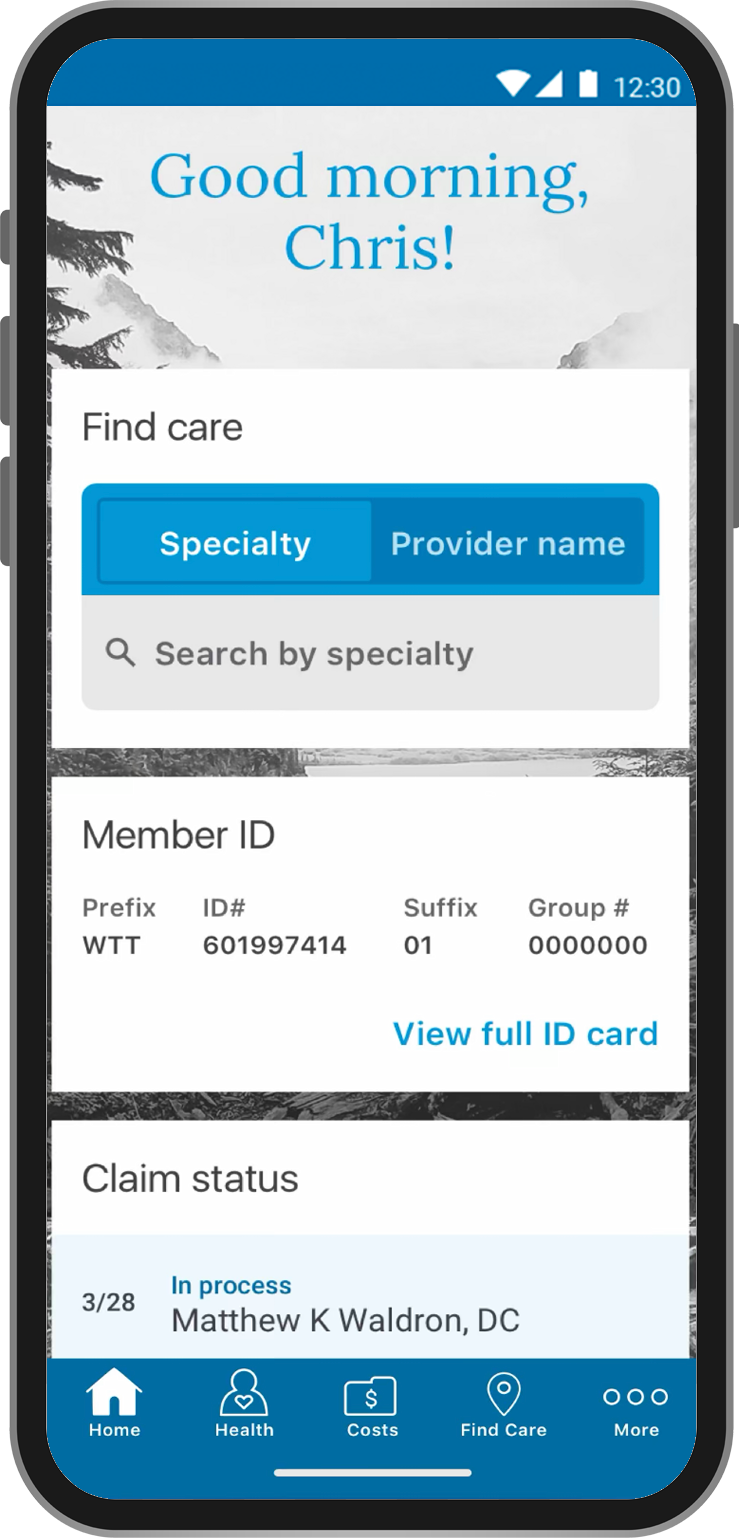
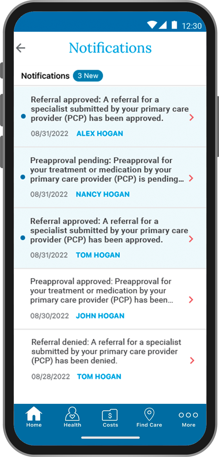
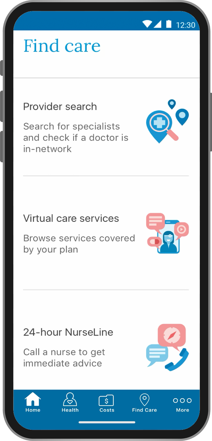
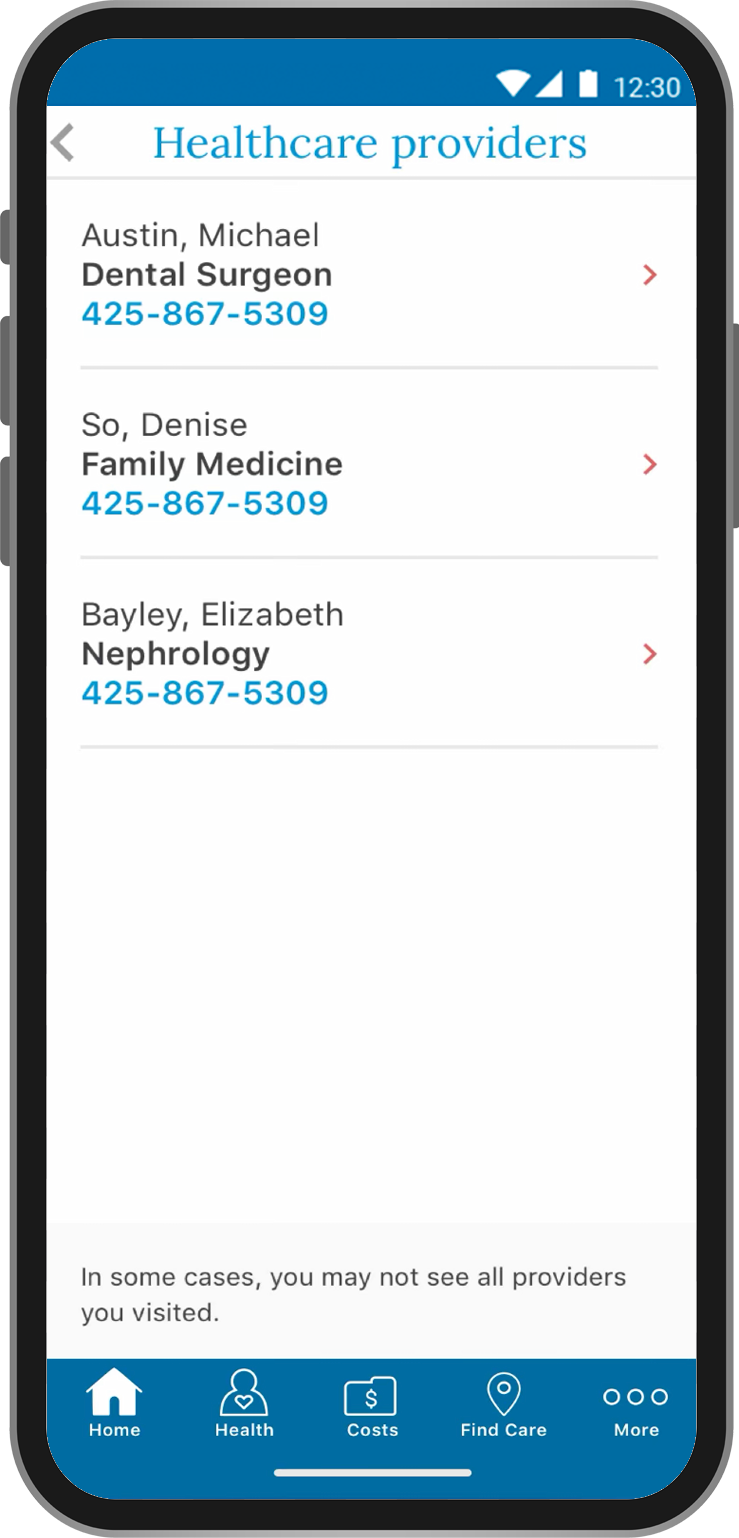
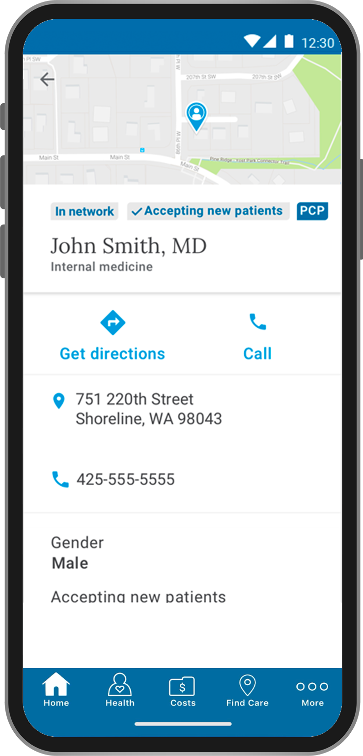
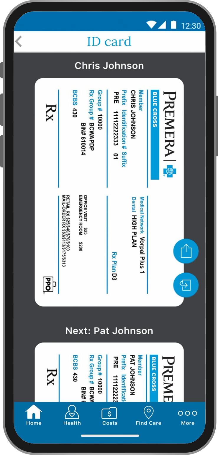
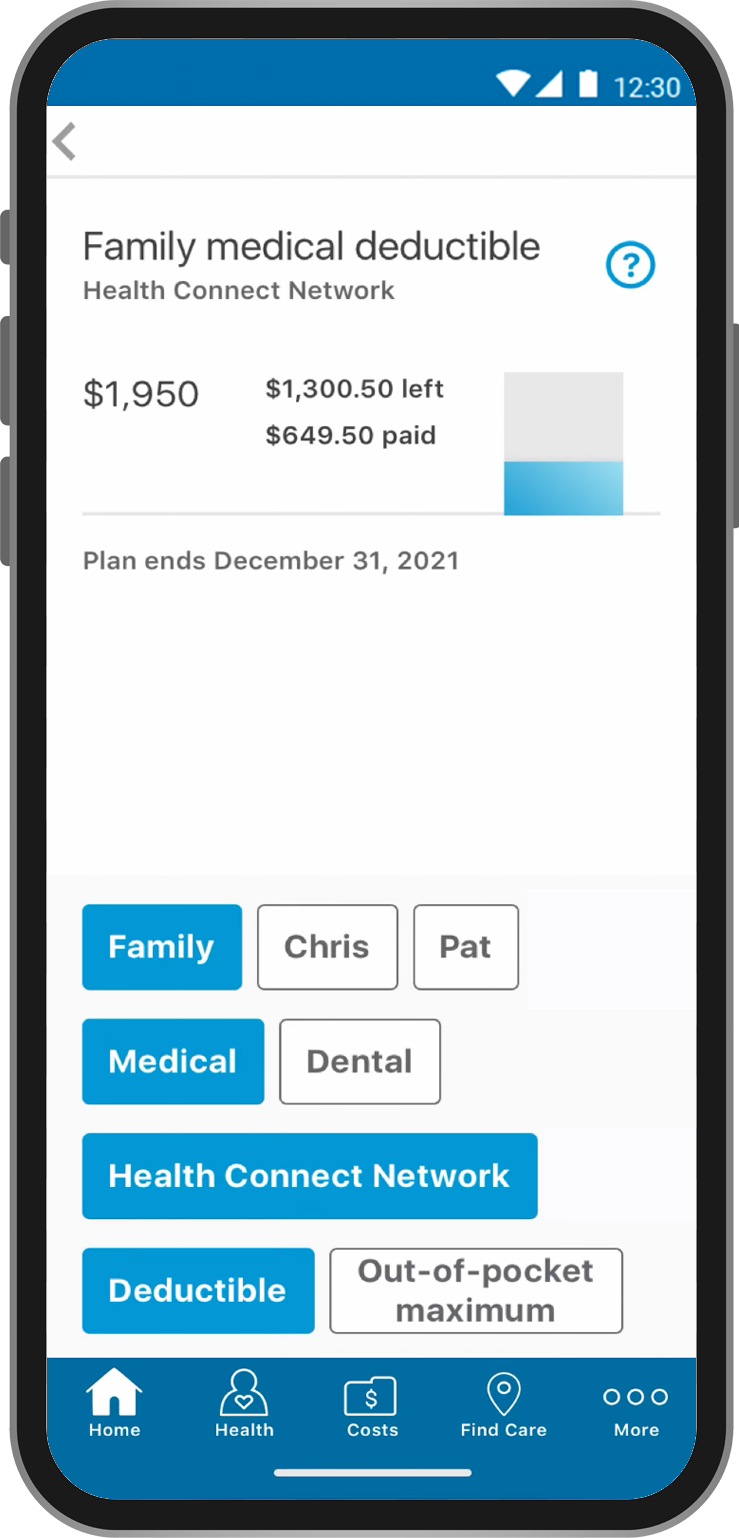
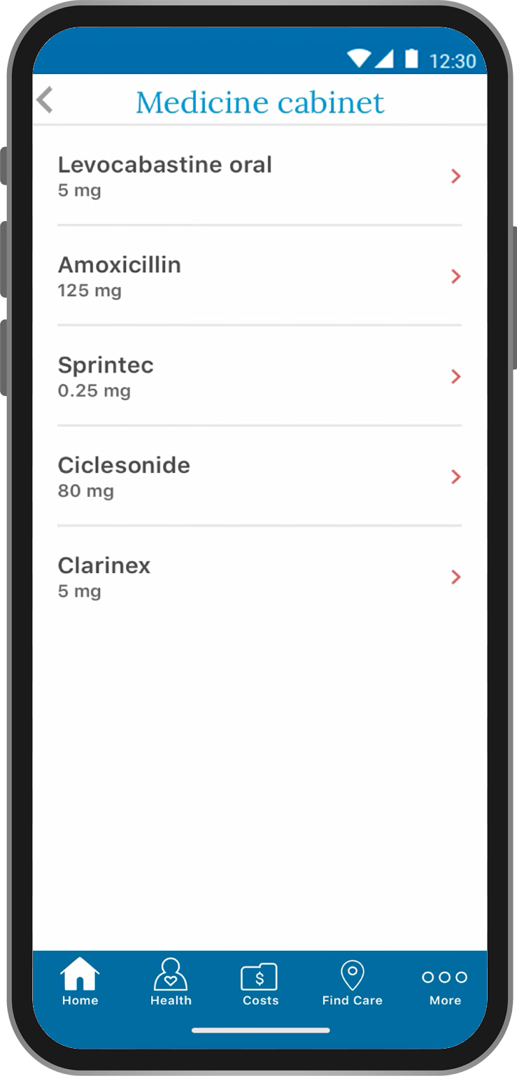
What I learned
Designing for healthcare in mobile spaces emphasized the importance of reducing cognitive load, avoiding jargon, and making essential information easy to find.
Working across both Android and iOS sharpened my ability to preserve UX consistency while respecting platform-specific conventions.